Caminhos confusos
Dark Forces
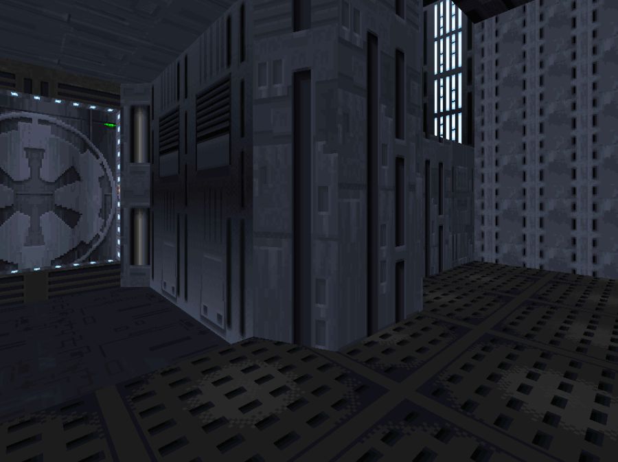
Note que no começo da instalação há muitas viradas para a esquerda e para a direita, incluindo laços. Isso deixa o jogador desorientados. Este padrão confusão se repete por todo o jogo.
- É a entrada;
- É um botão para abrir a porta, mas o jogador tem que correr antes que a porta feche
- É a área seguinte do level
- É uma área secreta opcional
Há dois elevadores no nível, mas os dois são idênticos por fora e por dentro. As texturas são iguais e a arquitetura por fora é igual. Fica difícil para o jogador se localizar e muito fácil de confundir áreas diferentes por causa das mesmas texturas e arquitetura. Mesmo que o problema seja limitação de memória para texturas diferentes, o level pode se aproveitar de uma geometria diferente para diferenciar áreas distintas.
No nível Fuel Station o mesmo problema. Há duas portas idênticas em corredores iguais. O que dificulta muito para o jogador encontrar o caminho.
Unreal Tournament 1999
Este nível tem um enorme pilar central com um elevador no meio. O pilar funciona como um ponto de referência. Todos os corredores e áreas estão dispostos ao redor da área central. Há três áreas com diferentes texturas. O problema é que as luzes azuis da entrada de cada área são iguais e as luzes do teto são iguais em todos os lugares. A arquitetura também não ajuda a distinguir as áreas entre si. O teleport é verde e há dois pares iguais, o que só ajuda a confundir mais ainda. Há uma contradição entre a arquitetura ser assimétrica na área central e as luzes serem todas simétricas.
Call of Duty: Modern Warfare 2
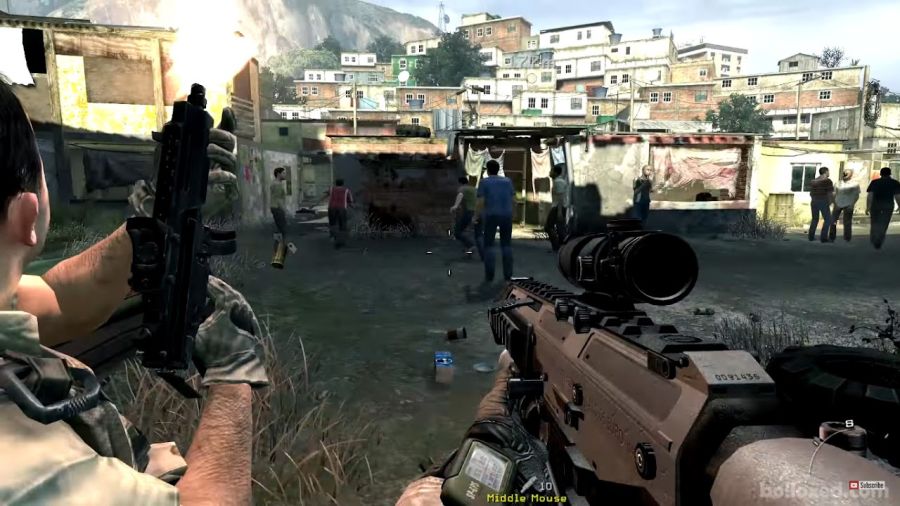
A missão da favela no Rio de Janeiro priorizou um cenário realista em detrimento da jogabilidade. A favela reproduz um ambiente real onde não há preocupação com ordem, cheio de becos, espaços estreitos e sem pontos de referência. O jogador fica numa posição de se sentir perdido, igual a um policial que adentra um território desconhecido numa operação mal planejada. Quem é o inimigo e quem não é? De onde vem os ataques? A ironia é que o level foi mal planejado e isso é o que acontece em operações mal planejadas de verdade. Uma operação policial precisa ser pensada ou será uma operação suicida. Eu não posso dizer que era intencional ou não por parte dos desenvolvedores, mas que criou um problema isso criou.
Se você olhar a favela de longe, é um caos e poluição visual. Não há linhas guias ou pontos de referência na forma de uma casa mais alta ou com um estilo diferente. Todas as casas são iguais em geometria, cores e estilo. Procure por Cantagalo, Rio de Janeiro, e veja como o level do jogo é semelhante à comunidade que serviu de inspiração.
Procure por Cantagalo, Rio de Janeiro e veja como o jogo é bem fiel ao local no qual foi baseado.
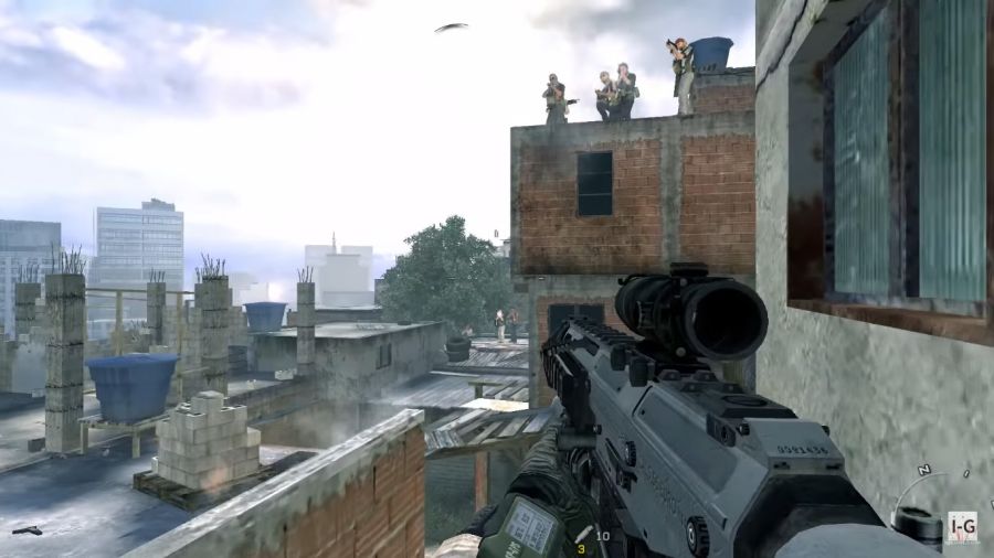
Cena 2: Neste ponto o jogador vê o caminho se dividir entre esquerda ou direita. Nada no level indica que seguindo as escadas da direita não leva a lugar nenhum. A porta da casa não abre. O mapa é linear, mas em algumas partes o jogador pode dar a volta numa casa ou adentrar. Isso gera confusão.
Cena 3: O morro parece uma escada e para piorar tem uma textura igual que o jogador já pisou antes. Mas não é para ir por ali, tem uma parede invisível. Os desenvolvedores não puseram uma grade ou remodelaram o terreno para não parecer um caminho. Se o jogador seguir as placas de madeira para a direita, cai numa emboscada com inimigos numa posição desfavorável para o jogador.
Cena 4: Coisas que podem ajudar a indicar o caminho: grafite ou pichações de armas apontando numa direção; objetos como canos ou sacos de lixo que indiquem o caminho; postes com fiação que sirva de linhas guia; até o alinhamento de janelas e portas pode servir para direcionar o jogador; texturas com contraste que direcionem o jogador; caixas d'água ou telhados coloridos que se destaquem no cenário; se uma grade tiver uma porta que não abre, é melhor deixar claro com correntes ou madeiras que o jogador pode avistar de longe.
Control
In the grand scale, Control's level design contradicts some natural coherence that we have in our world. If we are inside a building and Jesse's room and Joe's room are both on the same 10th floor of the same building, we expect to be able to go from one room to another without having to go from one floor to another. This is exactly the rule that this game breaks. Putting aside the game's excuse of playing with weirdness and unnatural spaces for a while, it's very confusing to go from point A to point B when we have to go under or above another floor, yet both A and B belong to the same floor. The level design in this game confuses the player because there are places which have the same height, but to go from one to another the player has to travel under or above another's floor in the same building. Or the opposite, the player goes up or down some stairs but they still are within the same area.
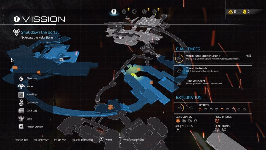
The other aspect that makes Control's level design confusing is that the player is forced to memorize the location of locked doors or places blocked by a toxic biological entity. There are multiple rooms and places that require some security access level key or a biological immunity system that the player is granted after completing some missions. Some of these doors are the backtrack route, while others are optional extra rooms with secrets. There is no distinction between the two. The minimap provides no markings related to the location of such rooms and places. This combined with the previous paragraph makes Control very hard to navigate. There is a minimap, but for some unknown reason they decided to lay out all the floors on top of each other, making the map very hard to read. For a 1990 game such as Doom a 2D map was perfectly acceptable because there weren't rooms over rooms and all paths were essentially 2D. For a 3D world of a modern game though, a 2D minimap with all the floors stacked on top of each other is a nightmare to follow. By contrast, Doom 2016 adopted a 3D minimap which can be rotated and makes a clear distinction between different floors and areas.
To cite one mission in Control as an example of the above. When the player has to go to the Panopticon to complete a mission, it's very confusing to find the entrance to it because the nearby areas: the medical center, security, logistics and prime candidate program have stairs, corridors and are on different floors. Which makes it very confusing to progress in the game. If you look at the minimap you have the impression that one room is at the other side of a wall, yet you have to turn around and take a long route to get to the other side. A comment about the logistic area. There is a corridor that connects two parts. In one we have a darker space. In the other we have a much brighter space. Notice that the corridor leads a more indoor space into a more open space and vice-versa. It feels unnatural because both ends are corridors. The other thing that makes the building rather confusing to navigate are the doors. Notice that the corridor's door to the right and the bathroom's door to the left are identical. There is a "women's bathroom" sign but it draws much less attention that the yellow light above the door. This happens in real life too. We can confuse doors of closets, pantries, dressing rooms, cellars, etc if the door is exactly the same as the door to a bedroom for example.
I can't state that this is a mistake by itself because I don't know what priorities they had and how they decided to build things. Nonetheless, I'd like to make a comment. When you come out of the elevator you are presented with a huge stair and you can either go up or down. Going up you go to Dr. Darling's Office or The Dimensional Research. Going down you go to the Parapsychology sector. If you look up there is another floor up there, which can't be reached through the stairs in front of you. It's the Luck & Probability sector. How to get there? The textures and lighting are all photorealistic, yet the architecture is on a boundary between reality and fantasy. With this game's theme about alternate dimensions and shifting spaces it seems to be a sensible decision. But from a navigational point of view, it's rather confusing to some player's eyes.
If you follow the stairs with your eyes you'll notice that the architecture does suggest that there is a stair behind the walls, yet there isn't. The angled cut does suggest some spiral staircase around the tree in the middle, connecting multiple floors. With the building being huge the designers did suggest the existence of more rooms and sectors near the tree's peak. If they, the developers, had plans for more rooms and sectors there I can't know. In here I'd say that there were aesthetic reasons behind the decision to build this area with the suggestion that there exists upper floors and more rooms behind the walls. If you fly up there you'll find some secret areas with sealed doors and the existence of such doors supports the idea that the designers did want the player to feel that there is more to be explored.
Each sub area inside the Old House is more or less linear. If you ignore the minimap there is a steady progression of rooms, corridors, stairs and you should be able to always go forwards without getting lost. Except for some optional side areas and that's where the confusion begins, because the player often finds himself or herself going backwards because many doors and corridors are identical to each other. One example is when the player goes to the Research Sector for the first time. They can go down to the Threshold area, but it's entirely optional. A decision was made, related to the plot, where corridors and rooms never have windows to the outside world. The constant turns to the left and to the right, without having windows to show the outside of each area, creates the same confusion seen in Dark Forces. The player can't know for sure which direction they are heading to. It's disorienting. Another example of how disorienting the level design is, is the elevator from the Parapsychology area to the Luck & Probability area. If you look at the map, it's an elevator that travels sideways and not only that, has doors placed on different faces of it. It reminds me of the elevator in the movie "Charlie and the Chocolate Factory".
Before I comment I should stress out that there may be artistic reasons behind the following decisions. When the player goes out of the Director's Office, the red carpet draws the player' attention straight forwards. Not only that, they placed a little island with benches right in front of the door that leads to the corridor to the Executive Central. Why? No idea. If the player has just found the hotline and completed the mission, they may not notice the door to the left and run straight forwards. This way they take the much longer route back to the Executive Central to be assigned their next mission.
Taking a look at the map, the corridor right under the one I mentioned in the previous paragraph, leads to the main's building elevator. In this case the game clearly has an excuse of dealing with extra dimensional spaces. Inside the elevator we don't have buttons that indicate floors, meaning that the elevator is not what we would expect from the real world.


