Lack of any sense: Difference between revisions
Created page with "= <center>Duke Nukem Forever</center> = <div class="jcarousel-wrapper"> <div class="jcarousel"> <div class="jcarousel-list"> <div class="jcarousel-item"> <center>900px</center> </div> <div class="jcarousel-item"> <center>900px</center> </div> </div> </div> <span class="jcarousel-control-prev">‹</span> <span class="jcarousel-control-next">›</span> <p class="jca..." |
No edit summary |
||
| Line 1: | Line 1: | ||
= <center> | = <center>Prey 2006</center> = | ||
<div class="jcarousel-wrapper"> | <div class="jcarousel-wrapper"> | ||
| Line 5: | Line 5: | ||
<div class="jcarousel-list"> | <div class="jcarousel-list"> | ||
<div class="jcarousel-item"> | <div class="jcarousel-item"> | ||
<center>[[image: | <center>[[image:prey2006_sense1.jpg|900px]]</center> | ||
<center>''Level 16''</center> | |||
</div> | </div> | ||
<div class="jcarousel-item"> | <div class="jcarousel-item"> | ||
<center>[[image: | <center>[[image:prey2006_sense2.jpg|900px]]</center> | ||
<center>''Level 16''</center> | |||
</div> | </div> | ||
</div> | </div> | ||
| Line 17: | Line 19: | ||
</div> | </div> | ||
In this part of the game there are these blue energy capsules. If the player shoots them they explore and destroy the bridge. The game provides no explanation for this. It's not part of the plot nor it has any meaning. It's there to show that the game features destructible environments. That or there was some scripted event that was discarded before the final version. If the player shoots the capsules and ruin their way forward they can still progress because there are two landing pads placed that work as an alternate path. In case the player destroys the bridge they can still travel to the other side by means of a shuttle. It's very strange to fly using a shuttle to travel a distance of a few meters. To make matters even more illogical the enemies in this room can fly, which means that destroying the floor can only hinder the player himself. | |||
<center>[[image:prey2006_sense3.jpg]]</center> | |||
<center>''Level 10''</center> | |||
<center>[[image: | |||
<center> | |||
The game doesn't make good use of its own tech. Why is the anti-gravity track being used to cross a chasm by walking upside down? In the background there is a regular bridge, so why overcomplicate things by using an anti-gravity track like that? Were the tracks placed on the walls it'd be at least more meaningful than having a bridge that forces the player to walk upside down for no reason. | |||
Sometimes ideas can sound cool but in practice they aren't. | |||
| Line 84: | Line 34: | ||
<div class="jcarousel-list"> | <div class="jcarousel-list"> | ||
<div class="jcarousel-item"> | <div class="jcarousel-item"> | ||
<center>[[image: | <center>[[image:prey2006_sense4.jpg|900px]]</center> | ||
</div> | </div> | ||
<div class="jcarousel-item"> | <div class="jcarousel-item"> | ||
<center>[[image: | <center>[[image:prey2006_sense7.jpg|900px]]</center> | ||
</div> | </div> | ||
</div> | </div> | ||
| Line 99: | Line 46: | ||
</div> | </div> | ||
This platform isn't very high, yet the player has two ways to get up there. One is the anti-gravity track and the other is a dimensional portal that is opened by an enemy and left open. Wouldn't it be easier to have a lift or a staircase? | |||
<center>[[image:prey2006_sense5.jpg]]</center> | |||
In here the player reaches a corridor at the edge of a chasm. Some enemies were placed here to try to stop the player's progress. For some strange reason the architectural choice made here broke the path in the middle of it, with no stairs or lifts. The player has to jump down to go inside the hole, which is a portal that teleports the player to inside a cube in the middle of the chasm. The player has to solve the cube's puzzle to progress. | |||
= <center>Duke Nukem Forever</center> = | |||
<center>[[image:dnf_sense1.jpg]]</center> | |||
<center>[[image: | <center>''The Hive''</center> | ||
<center>'' | |||
In The Hive's level there are organic light sources that can be destroyed to prevent some enemies from using them against the player. This isn't an horror game and much less a game's mechanic for the player to take advantage of. It's completely nonsense for the player to destroy the lights in a dark place to prevent certain enemies from using them against the player. | |||
<div class="jcarousel-wrapper"> | <div class="jcarousel-wrapper"> | ||
| Line 122: | Line 65: | ||
<div class="jcarousel-list"> | <div class="jcarousel-list"> | ||
<div class="jcarousel-item"> | <div class="jcarousel-item"> | ||
<center>[[image: | <center>[[image:dnf_sense2.jpg|900px]]</center> | ||
<center>'' | <center>''The Hive''</center> | ||
</div> | |||
<div class="jcarousel-item"> | |||
<center>[[image:dnf_sense3.jpg|900px]]</center> | |||
<center>''The Hive''</center> | |||
</div> | </div> | ||
<div class="jcarousel-item"> | <div class="jcarousel-item"> | ||
<center>[[image: | <center>[[image:dnf_sense4.jpg|900px]]</center> | ||
<center>'' | <center>''The Hive''</center> | ||
</div> | </div> | ||
<div class="jcarousel-item"> | <div class="jcarousel-item"> | ||
<center>[[image: | <center>[[image:dnf_sense5.jpg|900px]]</center> | ||
<center>'' | <center>''The Hive''</center> | ||
</div> | </div> | ||
</div> | </div> | ||
| Line 140: | Line 87: | ||
</div> | </div> | ||
This obstacle doesn't follow the game's own rules. When the player reaches this place a door closes behind the player, locking him or her. There is a corpse, blood and pipe bombs. The player is left with no directions or clues at all. What the player has to do is to throw a pipe bomb at the jump pad and detonate it after the bomb reaches the little opening where the creature with purple light is. The thing is, why can't the player just toss the pipe bomb or fire a rocket directly at the creature? The design of this whole obstacle is nonsense. Even worse, after finally getting the creature to roll out of that little opening, the door that was closed opens up again when the player pushes the key. | |||
The | |||
| Line 161: | Line 94: | ||
<div class="jcarousel-list"> | <div class="jcarousel-list"> | ||
<div class="jcarousel-item"> | <div class="jcarousel-item"> | ||
<center>[[image: | <center>[[image:dnf_sense6.jpg|900px]]</center> | ||
<center>'' | <center>''The Clone Carousel''</center> | ||
</div> | </div> | ||
<div class="jcarousel-item"> | <div class="jcarousel-item"> | ||
<center>[[image: | <center>[[image:dnf_sense7.jpg|900px]]</center> | ||
<center>'' | <center>''The Clone Carousel''</center> | ||
</div> | </div> | ||
</div> | </div> | ||
| Line 175: | Line 108: | ||
</div> | </div> | ||
I have no idea why they placed this pillar in the middle of the player's way. | |||
<center>[[image: | <center>[[image:dnf_sense8.jpg|900px]]</center> | ||
<center>''Duke Side of the Moon''</center> | |||
The | The last boss battle is completely nonsense. Duke has a vehicle but he has to get out of it in some parts of the battle. Duke doesn't have an astronaut suit and has to hold his breath. The developers decided to reuse the same underwater mechanic, but this time the water is replaced by vacuum. I've never seen a design decision that is so stupid and ridiculous like this. | ||
Latest revision as of 02:20, 10 February 2025
Prey 2006
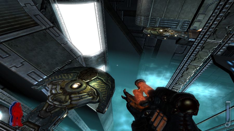
In this part of the game there are these blue energy capsules. If the player shoots them they explore and destroy the bridge. The game provides no explanation for this. It's not part of the plot nor it has any meaning. It's there to show that the game features destructible environments. That or there was some scripted event that was discarded before the final version. If the player shoots the capsules and ruin their way forward they can still progress because there are two landing pads placed that work as an alternate path. In case the player destroys the bridge they can still travel to the other side by means of a shuttle. It's very strange to fly using a shuttle to travel a distance of a few meters. To make matters even more illogical the enemies in this room can fly, which means that destroying the floor can only hinder the player himself.
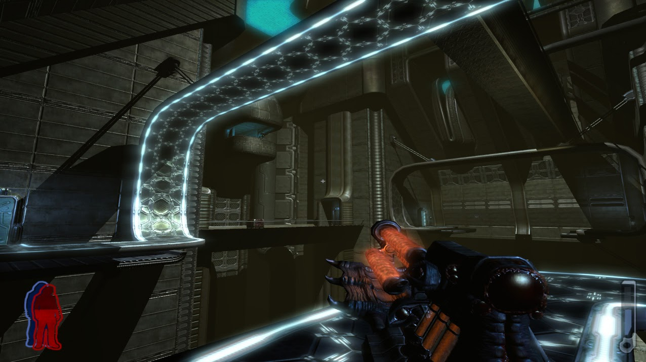
The game doesn't make good use of its own tech. Why is the anti-gravity track being used to cross a chasm by walking upside down? In the background there is a regular bridge, so why overcomplicate things by using an anti-gravity track like that? Were the tracks placed on the walls it'd be at least more meaningful than having a bridge that forces the player to walk upside down for no reason.
Sometimes ideas can sound cool but in practice they aren't.
This platform isn't very high, yet the player has two ways to get up there. One is the anti-gravity track and the other is a dimensional portal that is opened by an enemy and left open. Wouldn't it be easier to have a lift or a staircase?
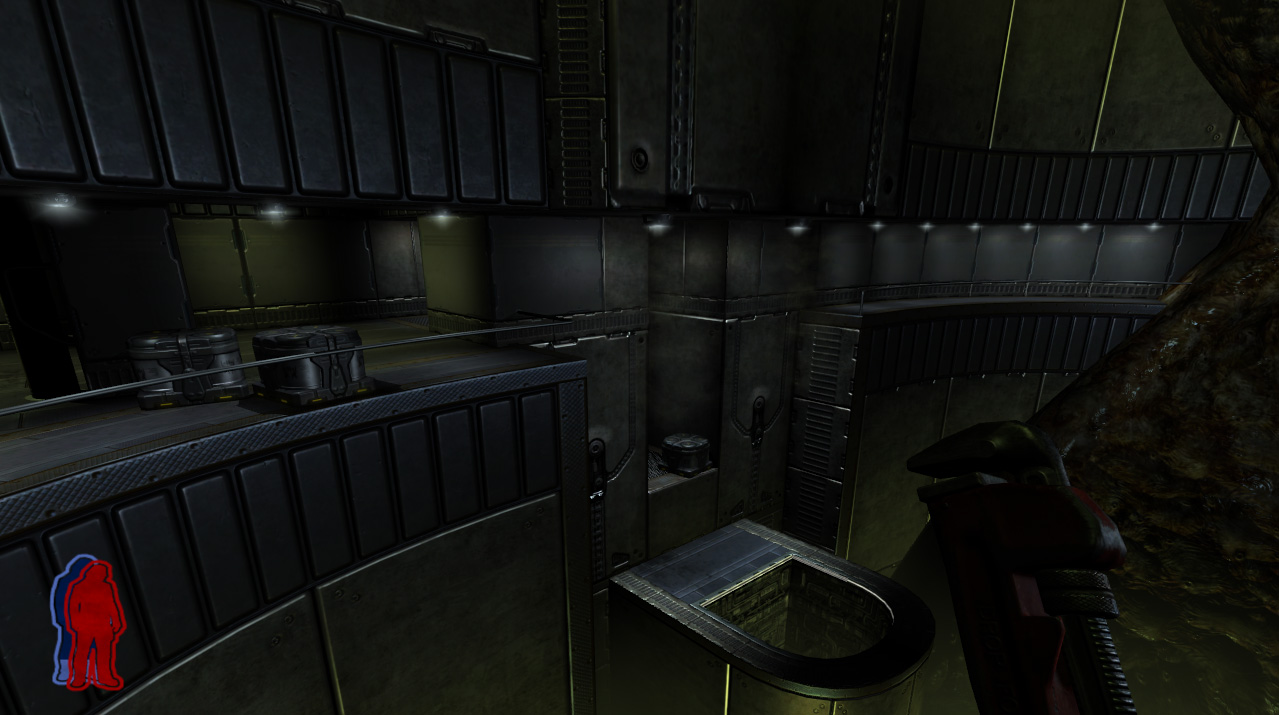
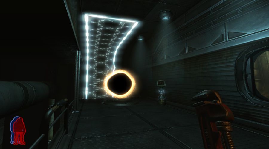
In here the player reaches a corridor at the edge of a chasm. Some enemies were placed here to try to stop the player's progress. For some strange reason the architectural choice made here broke the path in the middle of it, with no stairs or lifts. The player has to jump down to go inside the hole, which is a portal that teleports the player to inside a cube in the middle of the chasm. The player has to solve the cube's puzzle to progress.
Duke Nukem Forever
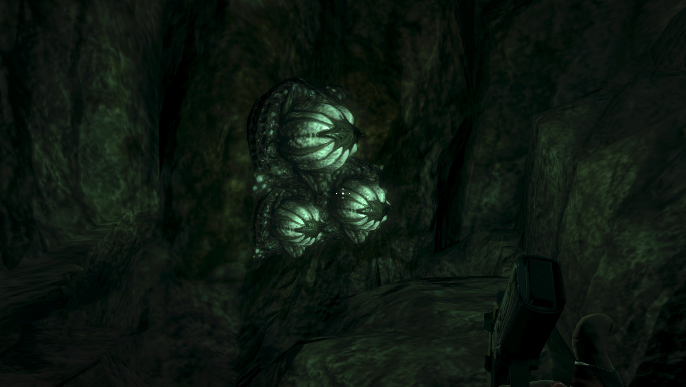
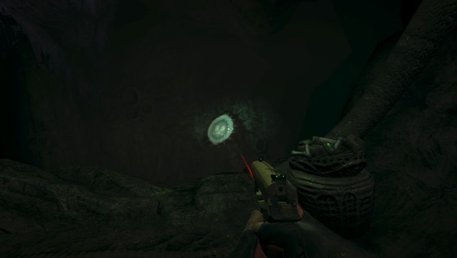
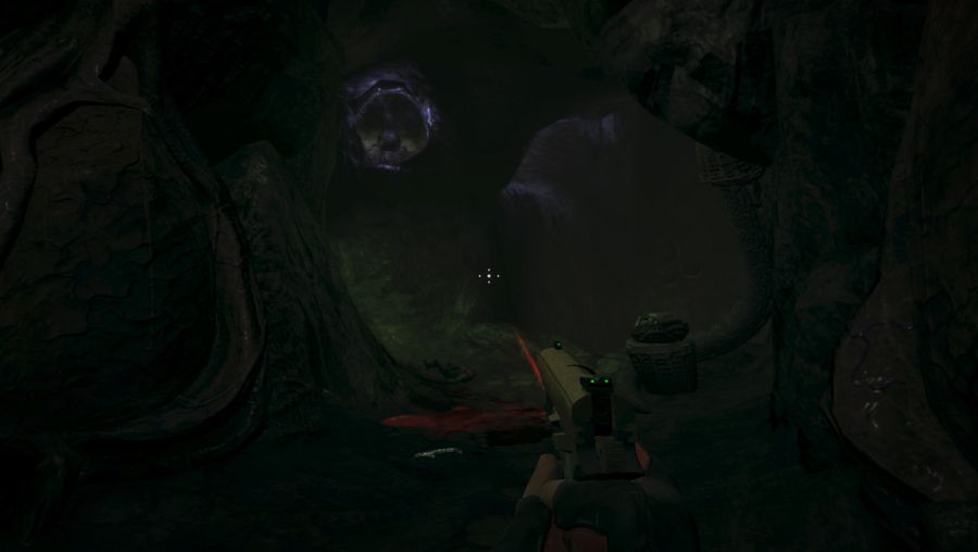
In The Hive's level there are organic light sources that can be destroyed to prevent some enemies from using them against the player. This isn't an horror game and much less a game's mechanic for the player to take advantage of. It's completely nonsense for the player to destroy the lights in a dark place to prevent certain enemies from using them against the player.
This obstacle doesn't follow the game's own rules. When the player reaches this place a door closes behind the player, locking him or her. There is a corpse, blood and pipe bombs. The player is left with no directions or clues at all. What the player has to do is to throw a pipe bomb at the jump pad and detonate it after the bomb reaches the little opening where the creature with purple light is. The thing is, why can't the player just toss the pipe bomb or fire a rocket directly at the creature? The design of this whole obstacle is nonsense. Even worse, after finally getting the creature to roll out of that little opening, the door that was closed opens up again when the player pushes the key.
I have no idea why they placed this pillar in the middle of the player's way.
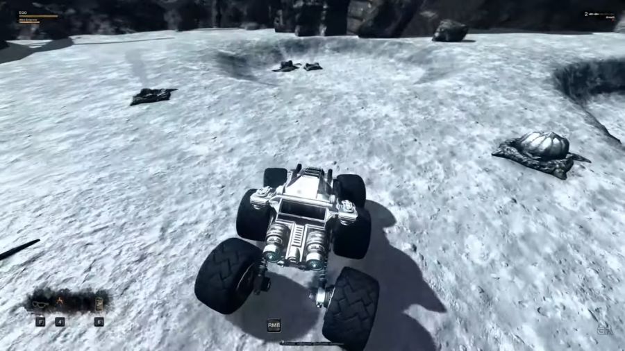
The last boss battle is completely nonsense. Duke has a vehicle but he has to get out of it in some parts of the battle. Duke doesn't have an astronaut suit and has to hold his breath. The developers decided to reuse the same underwater mechanic, but this time the water is replaced by vacuum. I've never seen a design decision that is so stupid and ridiculous like this.

